.svg)


.svg)

.svg)


Jenrey
Beverage Solutions: From Fermenting to Dispensing
.png)


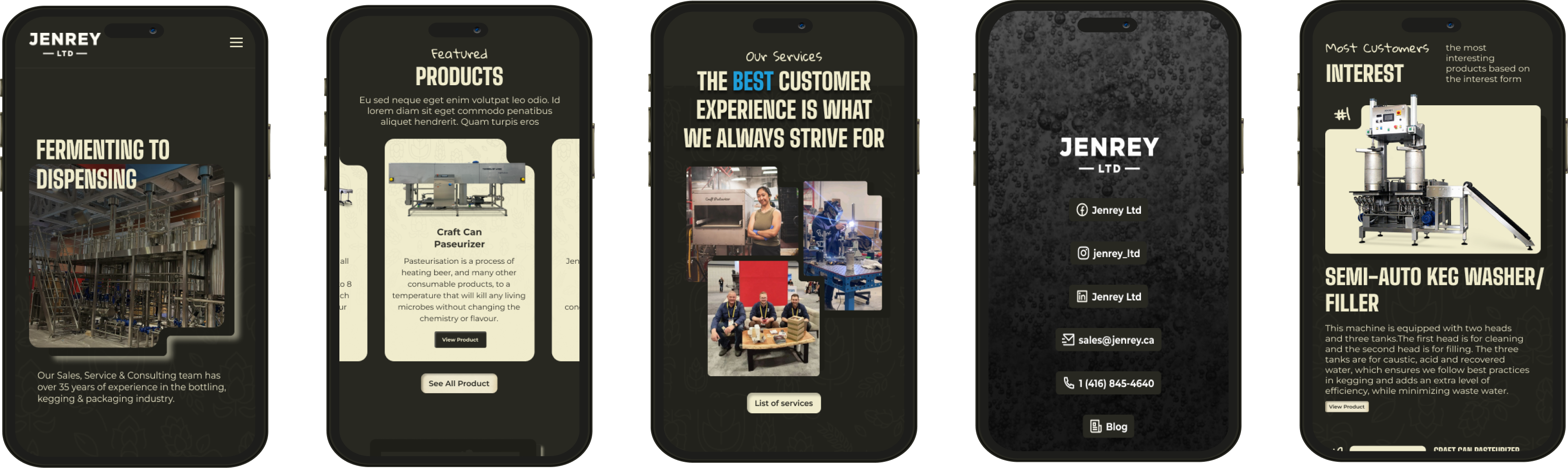
Jenrey wasn’t a blank canvas — it was an established name with grit and a deep network in the beverage manufacturing space. Our job wasn’t to reinvent that. It was to surface the trust, practicality and people-first reputation they’d already earned in the digital world - decades of experience made accessible, navigable and on display. From that understanding, we shaped a site that felt confident, clean, and quietly progressive. We leaned into dark tones and stencil-cut typography that reflected the industrial roots of the business. Sleek modular UI containers give the platform hints of warmth and a strong sleek structure.
.png)
The Challenge
Jenrey needed a brand refresh that did not lose its edge. With services spanning mechanical installation to brewery consulting, and partnerships across North America, we had to unify a lot under one roof. The old site was not doing that: information was buried, their personality was missing, and their credibility was not clearly visible. We needed to build trust quickly, speak directly to the industry, and make the site move with clarity, intent, and a bit of grit.
Laying The Groundwork
We mapped out the full Jenrey universe: services, partnerships, operations, legacy, and future growth plans. From parts installs and preventative maintenance to brand development and fermentation forecasting, the team’s capabilities were broad and deep. So we developed a visual and functional system that could grow with them. We restructured the navigation and service hierarchy. Added testimonial sliders. Introduced collapsible UI elements for detailed service menus. Refined calls to action and created space for their journey, from 2009 to today, to be told visually.Every update had one goal: clarity with character.
Start of the Journey
At the beginning of our design process were the architectural schematic, inspired sketches. We meticulously crafted these to spotlight Carefoote's core services and visualise the process. These are used throghout the website.


Crafting the Details
The mechanical world isn’t cold – it’s precise. That principle shaped our approach. From the first business assessment, we understood Jenrey’s platform needed to reflect how they work: technical, fast-moving, and built on trust. We brought that rhythm into the interface itself. Microinteractions mirrored operational flow. Rounded tab corners referenced equipment casings. Button weights echoed control panel labelling. Each content zone was designed to reflect the full arc of the Jenrey experience – from first contact to long-term support, allowing their journey to come through clearly, without distraction.
To reinforce that story, we introduced a visual timeline that maps Jenrey’s growth from its founding in 2009 to today. It’s more than a roadmap – it’s a quiet marker of time, trust, and momentum
.png)
.png)
Filtering Out the Fluff
B2B service websites often over-explain or under-deliver. With Jenrey, clarity was the priority — not noise. We designed a hierarchy that let the expertise speak for itself, stripping back filler and letting services, partnerships, and credibility sit front and centre.
Expandable menus, icon-led modules, and testimonial sliders were used to guide visitors without overwhelming them. Each detail was there to support decision-making — whether you're a new brewery owner or a long-time production lead seeking support.
We weren’t just designing for clicks. We were designing for confidence.
Visual Storytelling
Our approach to STADIUUM's platform was holistic. Beyond the initial engagement, our designs emphasised the business priority of subscription conversions. We developed vectorial illustrations catering to STADIUUM's target customer segments.
These illustrations were dual-purpose - identifying nad humanising with the core audience through user persona illustrations of the three core target audience subsets (sports bettors, sports fan & indsutry professional). As well as elucidating STADIUUM's unique market positioning through storng visual metaphor driven vectorial illustrations.

Immersive. Interactive. ROI Driven.
Every chart, graph, and data point was intentionally crafted to offer a multi-layered explorative experience. This ensured users didn't just view data, but actively interacted with it, making the process of comprehension immersive and memorable.
Though this process, attention can then be channeled into 1. subscription touch points. 2. betting affiliate marketing touch points. A tactical, ROI-centric SaaS platform construction fused into our UX approach.


Pure art
Digital canvas
First impressions are everything, especially in the digital landscape. D'Vinci recognised this and undertook the ambitious project of creating a landing page that would immediately captivate any visitor.The result was a mesmerizing vectorial illustration, meticulously crafted over 40+ hours, cutting through the complexity it strived to deliver an immediate intimacy to website visitors to what firesight is. visual and text narrative combing powerfully.
This visual masterpiece not only encapsulated the platform’s capabilities but also beckoned users to dive deeper. Paired with this, our team produced succinct, compelling narratives that effortlessly guided users through Firesight's offerings.

The Perfection of effortlessness
D'Vinci prioritised the integration of a voice-activated AI chat into Firesight.ai's platform. This wasn't just an add-on but a core user experience element. Our research dove into the daily rhythms and patterns of the target audience: freelancers, entrepreneurs & independent professionals. When do they typically access the platform? What kind of environment are they in? Are they more likely to type or to speak their queries? Answering these questions allowed us to tailor the voice chat's responsiveness and functionality to fit perfectly within their work habits.


Team
D'Vinci assembled a small group of individuals that thrive with design artistry and intricate interfaces. A focus on copywriting and tactical textual implementation also was factored into team formation... we could not be more proud of the result.


More Projects


our
OUtposts


.svg)
.svg)


.svg)